By Brianna Ritoli
When arriving on campus, the immediate impression that a first time visitor gets is that it is a very small campus when faced with college stereotypes. Although small, it is clear that the school is up to date and modernized. A limitation however that comes along with arriving at the school is where to enter. You can see that there are multiple entrances along all sides of the building, however, it is somewhat unclear as to which is the main entrance. This is something that could be further enforced.
Unless you have a map and schedule with the rooms of your classes, it is unclear which departments are located where. Every department should be more strongly presented to visitors at the school. Where there are staircases, at each floor there should be a directory indicating whether or not you are on the correct floor, or if you should keep moving up. This would be especially helpful to those who have never been to the school before and are just touring. Someone on a tour may only want to see their department of interest and they would not know this without guidance from an advisor. Adding signs would be extremely helpful in directing students to each department. The addition of these signs should be made at each of the main stairwells because they are what the student use the most often. It is unlikely that a student will be found in a secondary stairwell if they are unfamiliar with the school so, it is crucial we add these signs to the obvious, high-traffic stairwells.
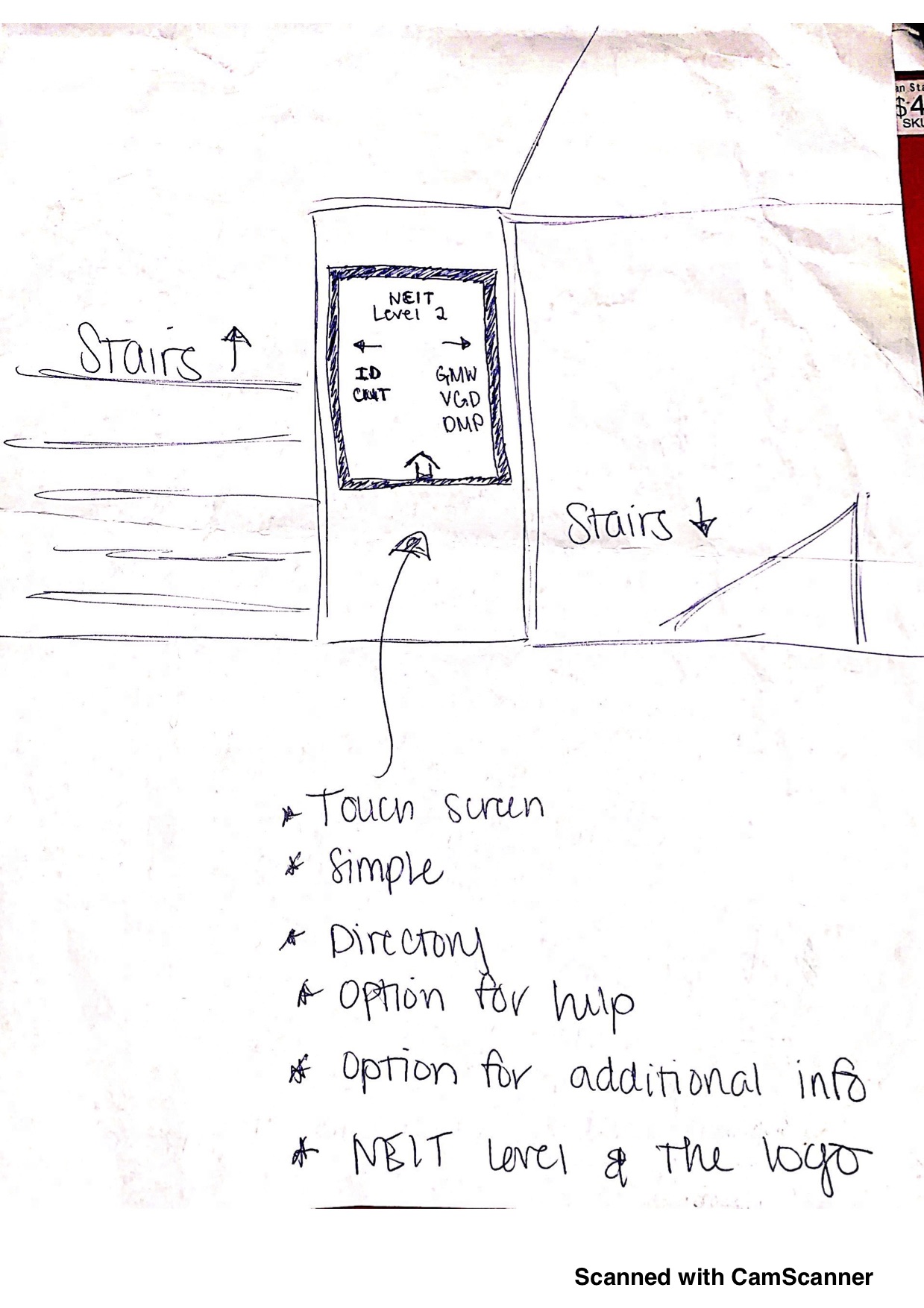
When students are coming up the stairs they don’t want to have to pull out their phone or a piece of paper to figure out where they should go next. They should be able to look at a sign and immediately go that way. This sign should be clear, short and simple. Although it should not be too simple where it is hard to understand, it should be informative. I believe this sign should be electronic and should allow for students to navigate through and find information regarding the departments and other areas of the school.
Below is what I envision for the added signage:

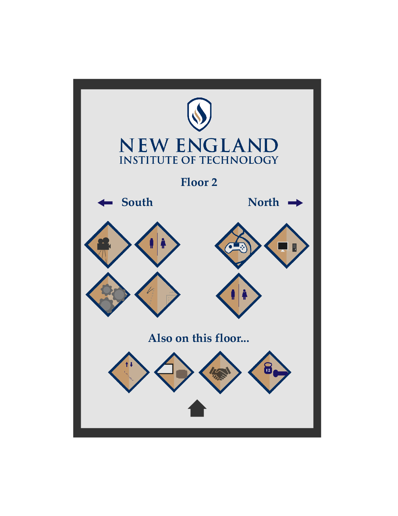
First time viewers will be looking at my directory and will be looking for their department of interest. Someone who is at the school for Video Game Design will automatically look for a controller and that is clear through my directory and pictograms. They expect that everything will be easy to find through a helpful and efficient directory. Being a first time visitor, they are completely unaware of their way around the school so it is crucial that this directory includes all of the important information “above the fold.” Each node/pictogram must be short and clear about what it is meant to perceive. In other words, a node for architecture should relate otherwise a first time visitor would have no clue where the architecture department is. The simple pictograms or nodes that I created are clear and will be helpful in directing first time visitors.
My polished kiosk design:

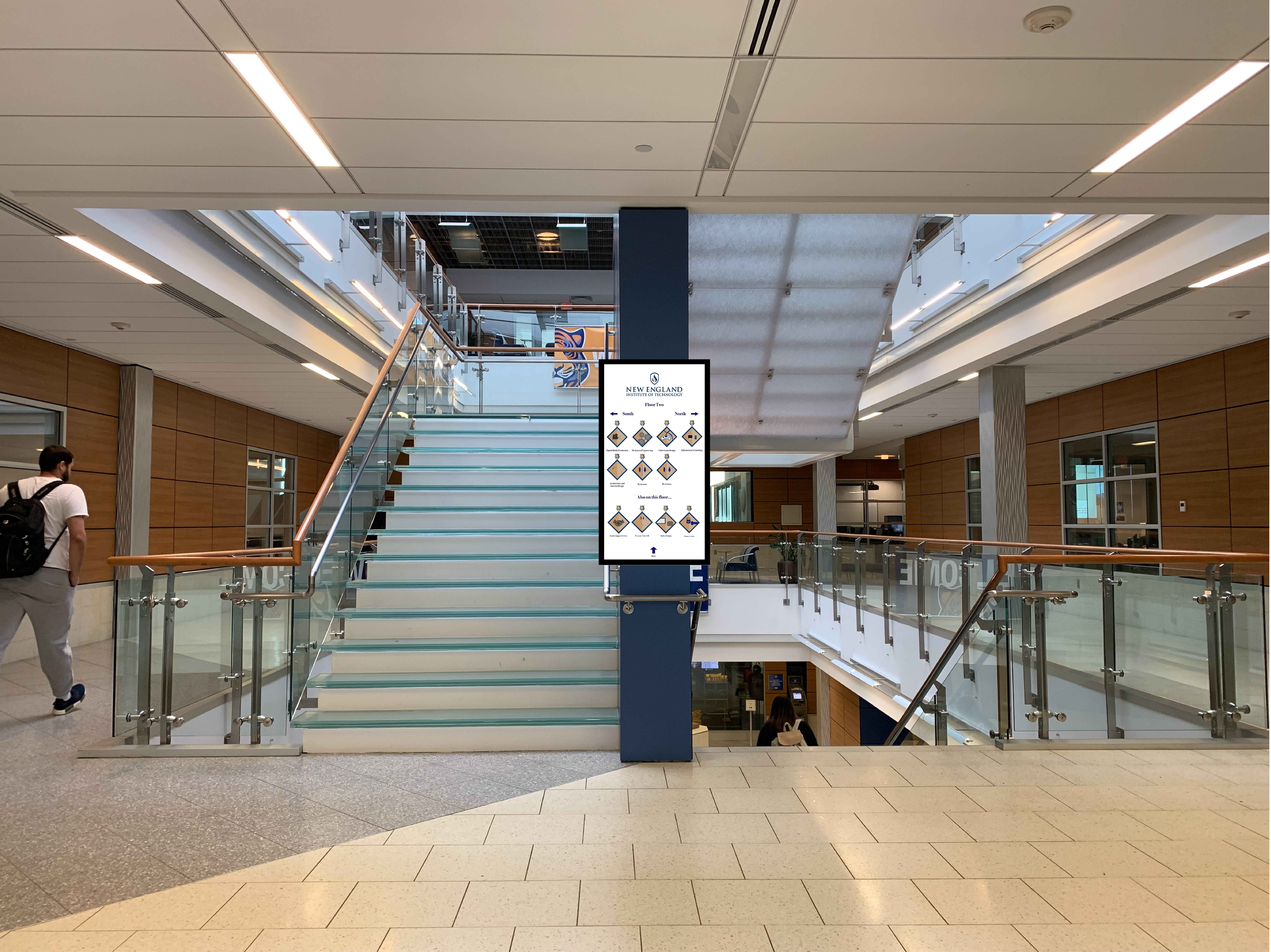
The kiosk as it would be seen in NEIT, at the main stairwell on floor two:

