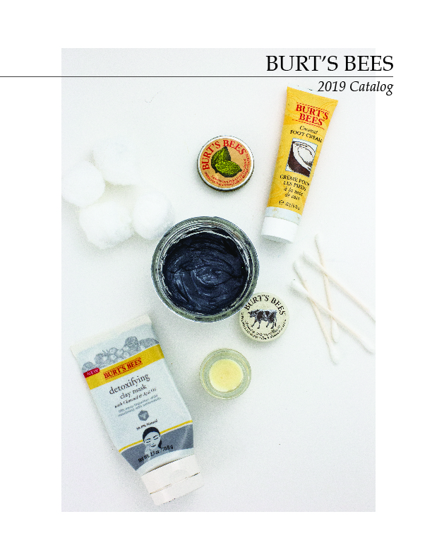
For the Catalog Design assignment, we were tasked with designing a catalog that was made up of product shots we photographed in Digital Photography 2.
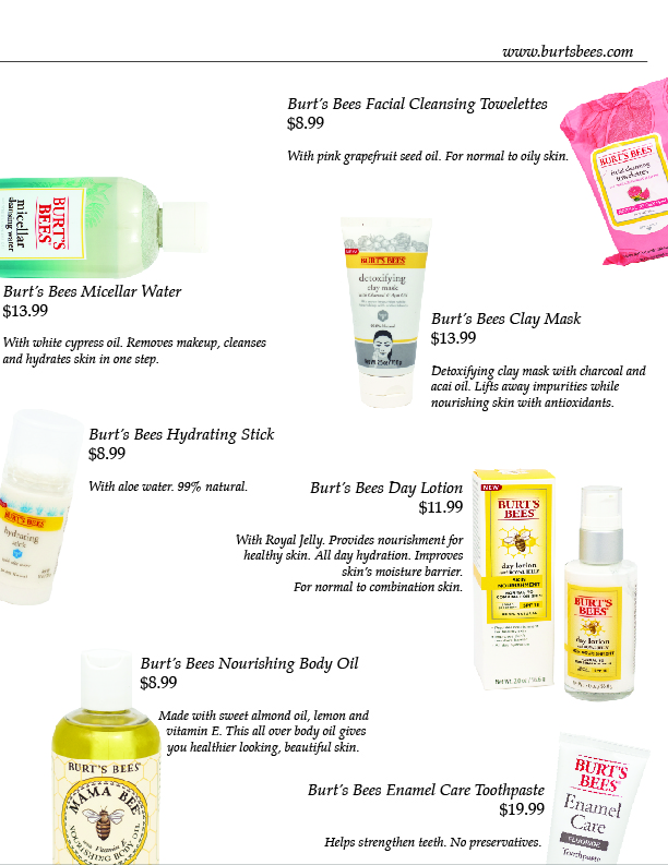
For the product shots, I photographed Burt’s Bees skincare products. I chose this brand because of its minimalistic style, something I possess as a designer. When we were given the assignment that was photographing products, we were also told that we would use them for a catalog in a later quarter. With that in mind, I knew that I needed simple looking products to help ease my design process. That being said, it would not necessarily make the thinking easier. But, it would help my simple, minimalistic way of designing flow with the products. A flashy product would never represent my brand or myself as a designer.
Once it came to beginning the catalog design, I felt stuck. But, with a little messing around and from inspiration taken from Pinterest, I was able to develop a design that I am extremely proud of. This design represents me and my design style 100% and that is just one of the reasons why I am proud of my work here.